Galaxies.dev
A web dev learning platform
Contribution
- Branding
- Product design
- Frontend development
Client
- Devdactic
- Simon Grimm
Dates
- 9/2022 - 4/2024
Context
Background
Simon Grimm of Devdactic & Ionic Academy wanted to create a platform for web dev beyond the tools he is known for to teach new JavaScript libraries to expand his customer base.
Challenge
Our challenge was to create a brand & web learning platform that can accommodate explorations into other JavaScript libraries & frameworks, as well as grow beyond his personal brand identity.
Role
I contributed to the strategy by creating a design vision based on the business goals. I guided the collaboration with the client and his team, handling the branding, design, and front-end UI development, including illustrations and animations.
Highlights
Adaptation
Where we landed
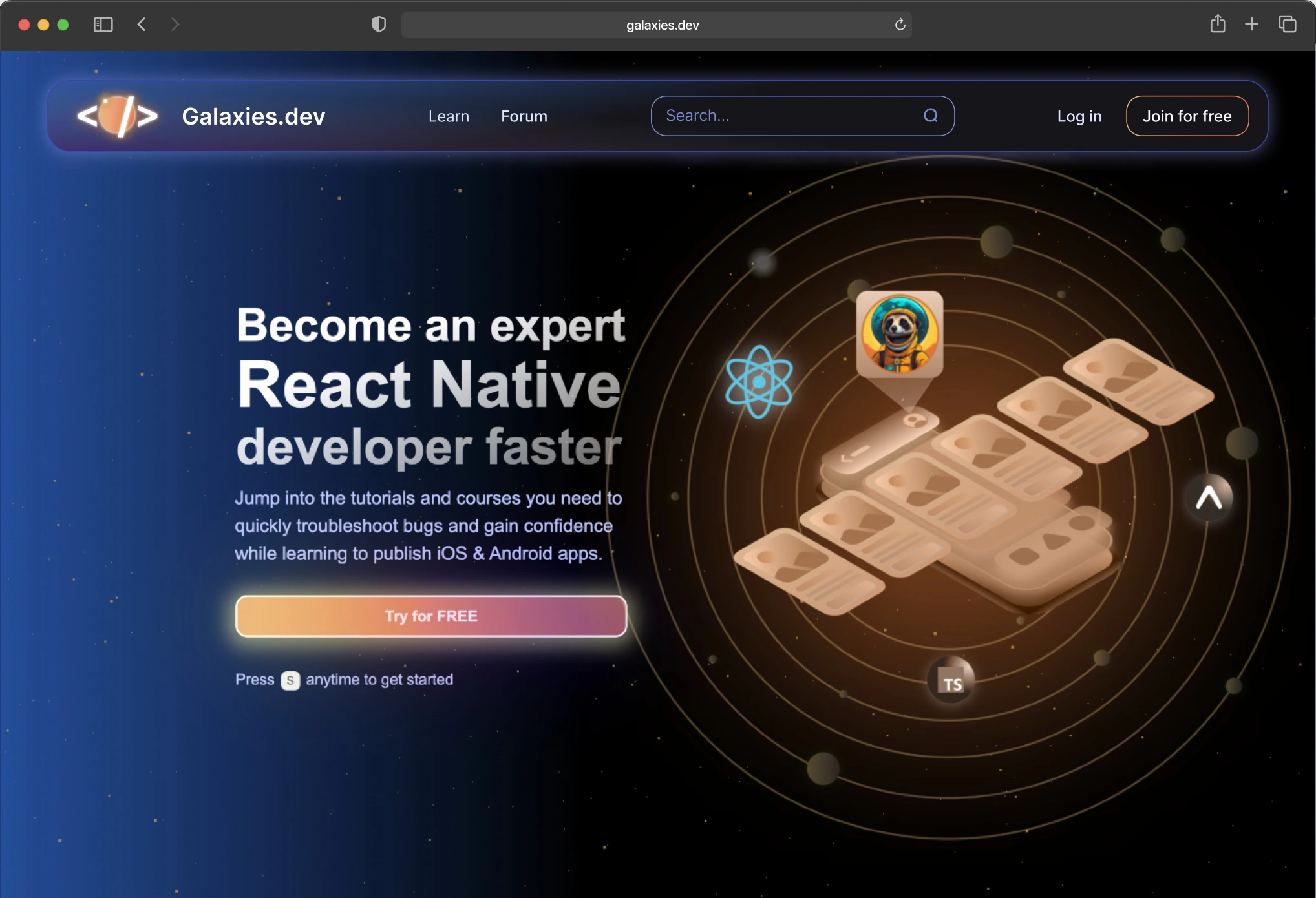
After our learnings based on our growth & user feedback, we created a new React Native-focused version of the service, a first of its kind.
Highlight
Magic button
A dynamic rainbow button that calls attention to the main CTA—what’s not to love? Hover me & see.
Attention to detail like this lets our tech savvy users know that we care about the little things and does it in a impactful way.
Adaptation
Animation
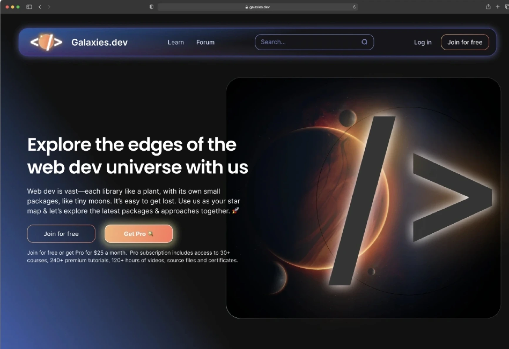
We implemented a dynamic SVG animation in our hero image, with content revolving around the new focus of the service. The animation grabs the attention of visitors and shows highly skilled dev-related polish, which resonates with our target audience.
Outcomes after adaptation
-
When compared with Simon's Ionic-focused sister service, galaxies.dev grew at a 10x rate after the React Native pivot.
-
After six months, the service had grown to the equivalent size as the sister service, which had taken more than six years.
-
Even after the initial growth of the service after pivot, galaxies.dev continues to have impressive growth, currently at 1,000 users per month.
Learn More About This Project
There's much more to this project, including the steps we took and the key decisions made along the way. If you'd like to see the full picture and explore the details, feel free to continue on below.
Process
Business goals
Create a new brand & service to expand business scope & customer demand.
-
The new service should broaden the range of JavaScript frameworks & libraries beyond Ionic to allow for exploration and to attract a wider audience.
-
Increase instructors beyond the previous service, allowing for growth by offering expertise of well-known, specialized developers, enriching the content & learning experience.
-
Create a new flexible brand identity that allows for the new frameworks & libraries as well as new expert instructors to enhancing the platform's appeal.
Research
What we want to understand
-
We need to understand customer preferences & challenges to create a exceptional learning experience.
- Identify preferred frameworks and libraries
- Determine content format preferences
- Uncover common learning challenges and pain points
-
Understanding competitors offerings & business models can help identify opportunities for differentiation.
- Analyze pricing models and course offerings
- Assess content variety and depth
- Evaluate UX & UI effectiveness
Research
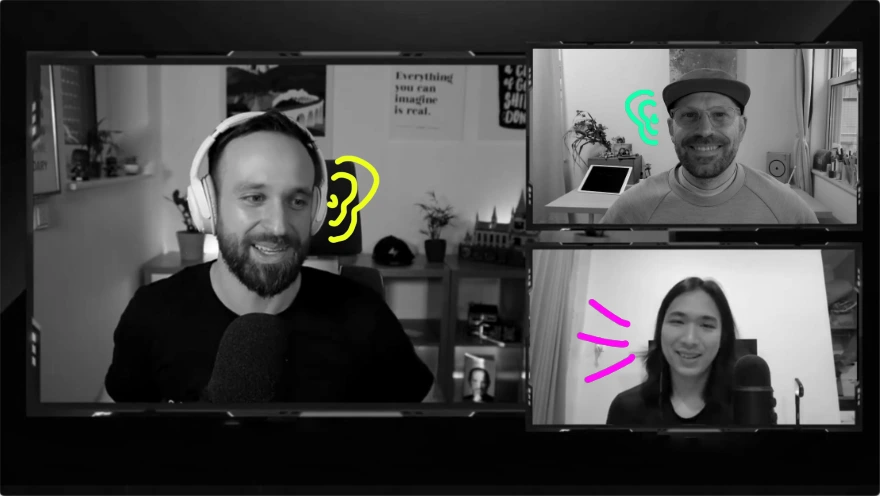
How we got insights from customers
Research
How we learned from our competitors
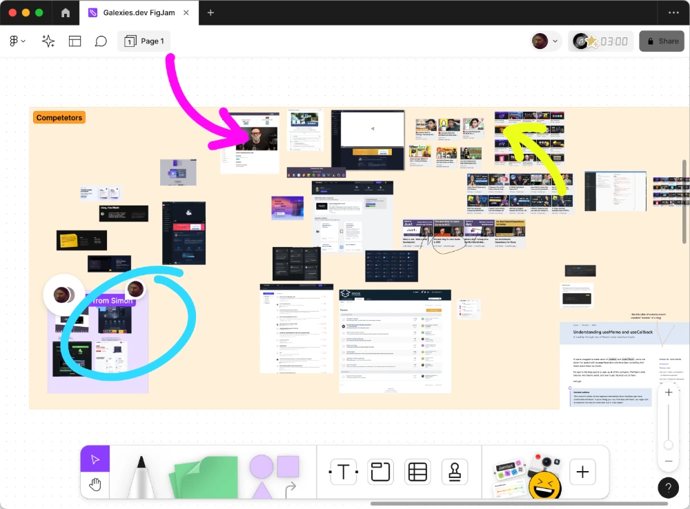
Research
What we discovered
- Intros to the newest libraries to keep up to date
- Short tutorials to try & in-depth videos to grow
- Practical application examples to apply in jobs
- Offering free tutorials & in-depth pro courses
- Update frequently with currently popular tech
- Help users apply techniques to their own apps

CONCEPT
How the concept took shape
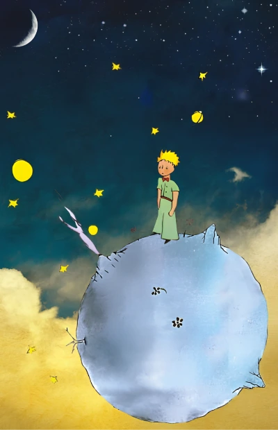
Guided by our goals & research, we employed design thinking techniques envision a path forward, and a powerful concept emerged: the metaphor of a "web development universe".
The idea of feeling lost in the vast expanse of web dev was a feeling we all could relate to.
This led us to a compelling visual framework: imagining libraries as planets, with related tech forming their own solar systems, as if there was a React solar system, with a Next.js planet and React Router moon.
This 'cosmic' approach not only organizes information intuitively but also captures the sense of exploration and discovery inherent in learning web development.
Release
Testing the waters
We used a coming soon page to gather email address and conduct surveys with users.
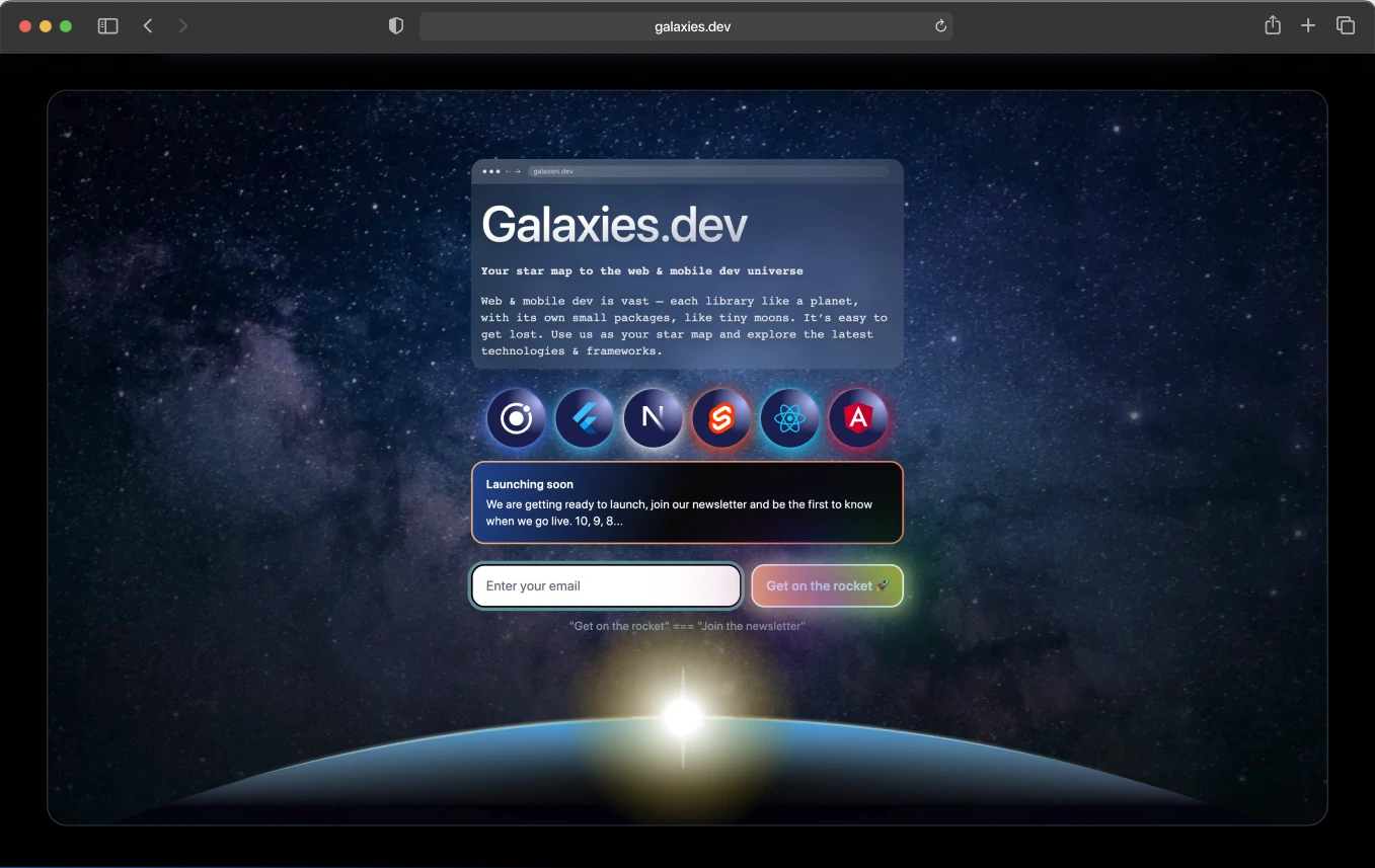
Concept
How the visual elements support the concept
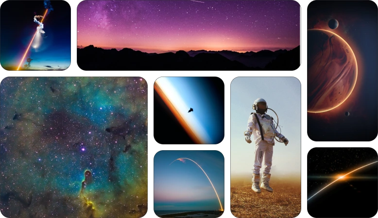
Using photos of space allows us to make the metaphor clear and make the content visually interesting.
Multiple colors give flexibility for use in different contexts.
Gradients on black evoke the stunning imagery of epic telescope photos like those from the Hubble, making them an ideal fit for our project concept.
Elements
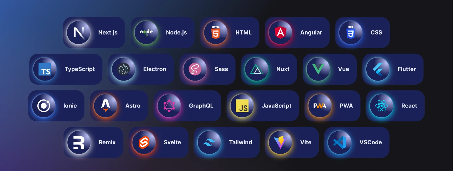
Tech planets
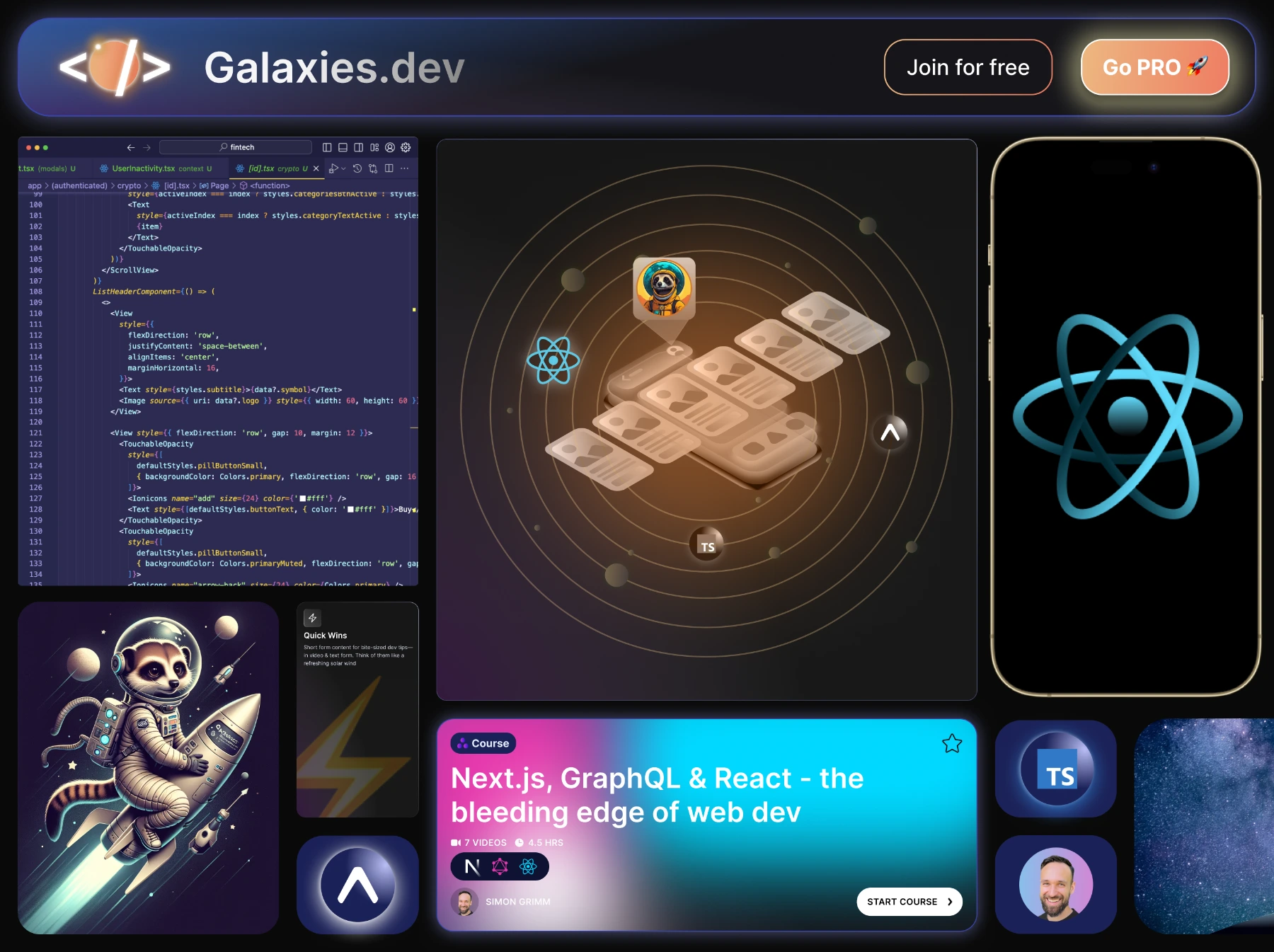
Using planets to encase the logos of libraries takes the difficult problem of how to display many visually different logos and makes it visually attractive and engaging.
Structure
Engage users through community & ecosystem
We identified challenges users face in self-learning. To enhance the appeal of our service, we offer multiple avenues for engagement and support, fostering a sustainable learning environment.
-
Videos & live streams allow users to engage and ask questions.
-
Users are encouraged to chat directly with instructors.
-
Highlighting Simon's podcast informs users that they can stay up to date by subscribing.
-
Subscribers can join office hours with instructors to get help with projects.
-
The forum lets users get help from other users in the community.
Showcase
Landing page
Putting it all together
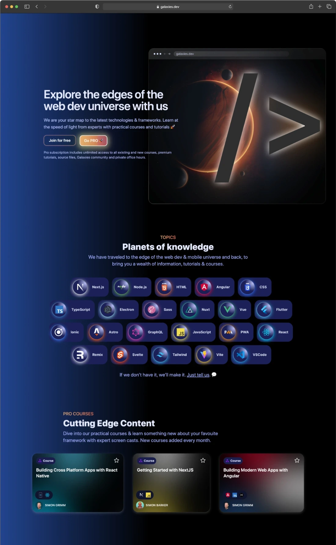
We created a flow for the landing page to maximize customer conversion.
The home page flow captures visitors' attention with a compelling value proposition and clear call-to-action, ensuring they quickly understand the service's benefits.
Subsequent sections build credibility and engagement through showcasing technical expertise and valuable content.
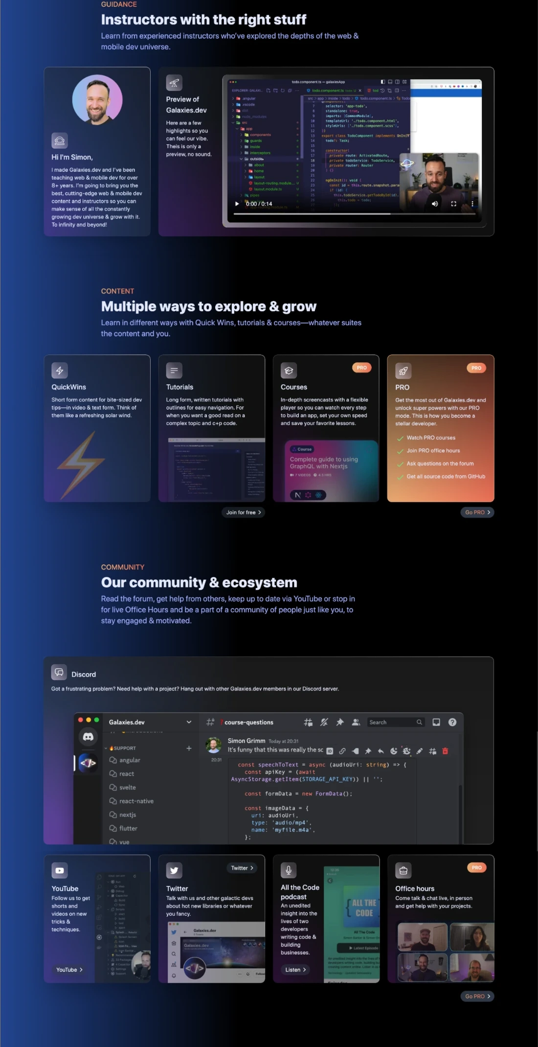
Interactive community elements show that they are not alone when learning, a customer pain point we identified. Featured content shows the highlights of the service to ensure conversions.
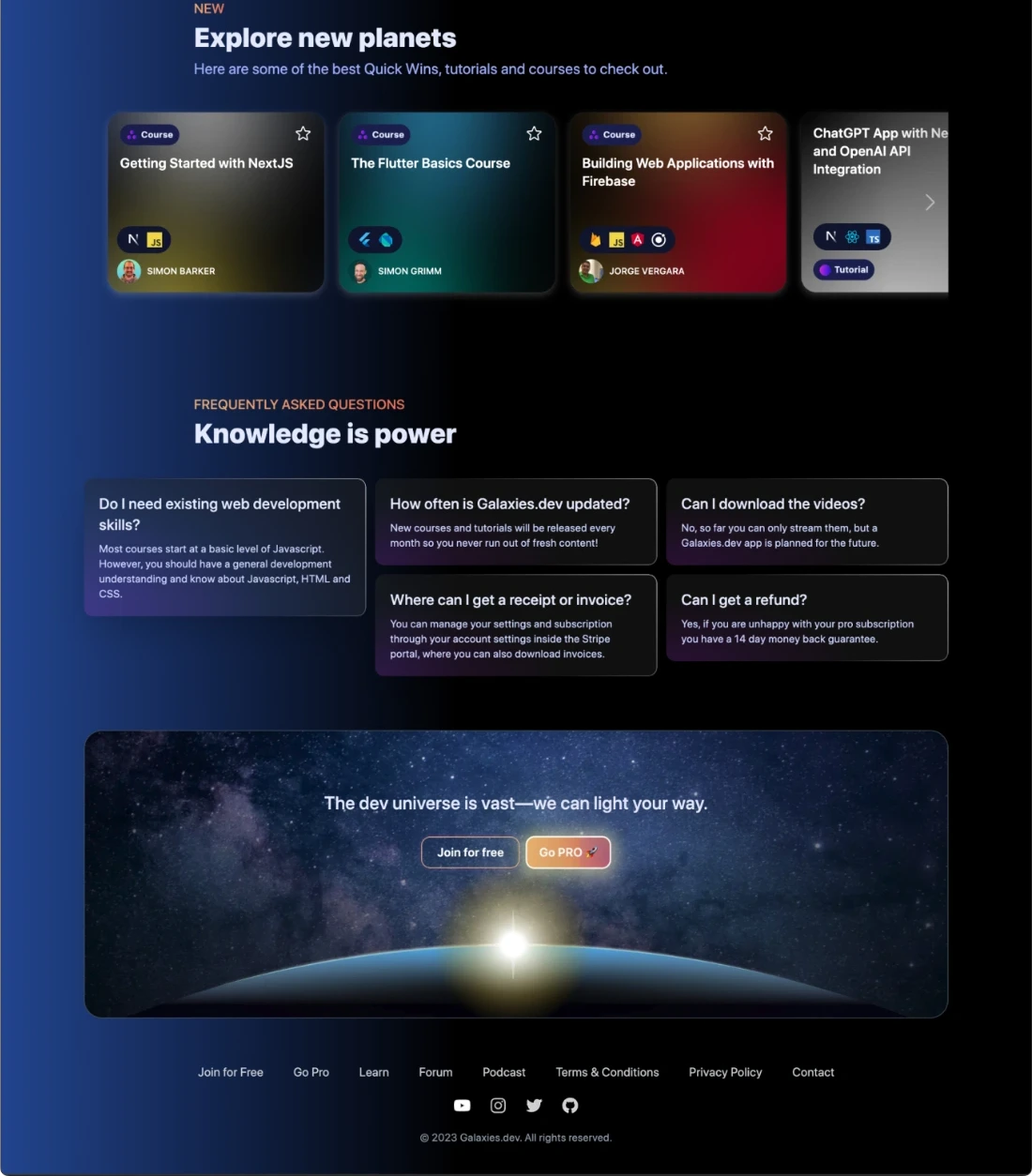
The final sections provide reassurance and a call-to-action, addressing doubts and prompting conversion.
Value proposition hero + CTA
Tech showcase
- Tech planets
Content types
- Quick Wins
- Tutorials
- Courses
- Pro value prop & CTA
Community & ecosystem
- Community
- Live streams
- Social
- Podcast
- Office hours
New & featured content
Guarantee & final CTA
Feature
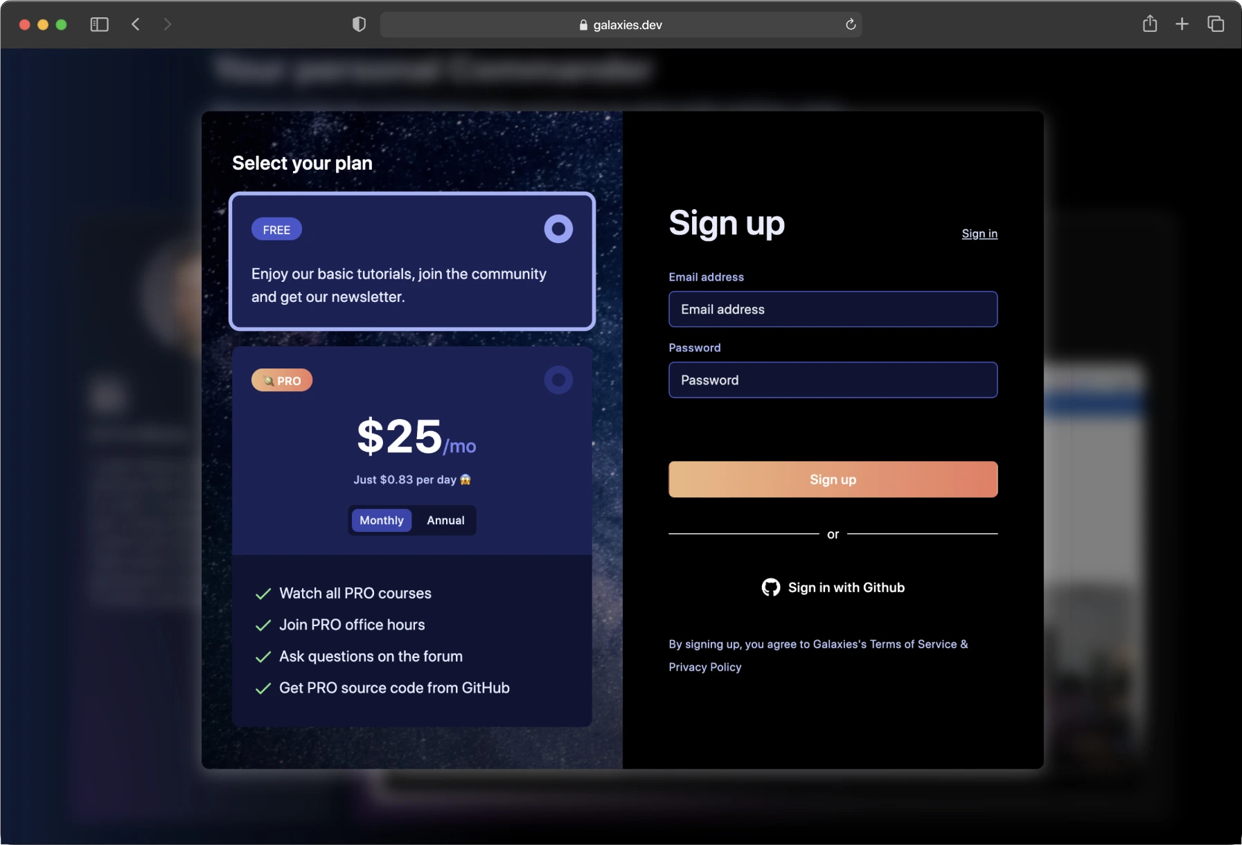
Simple sign-up & payment
Clear & simple sign-up, combined with easy-to-understand payment flow increase conversions, so making multiple quick access points with a minimal step flow was important to us.
Feature
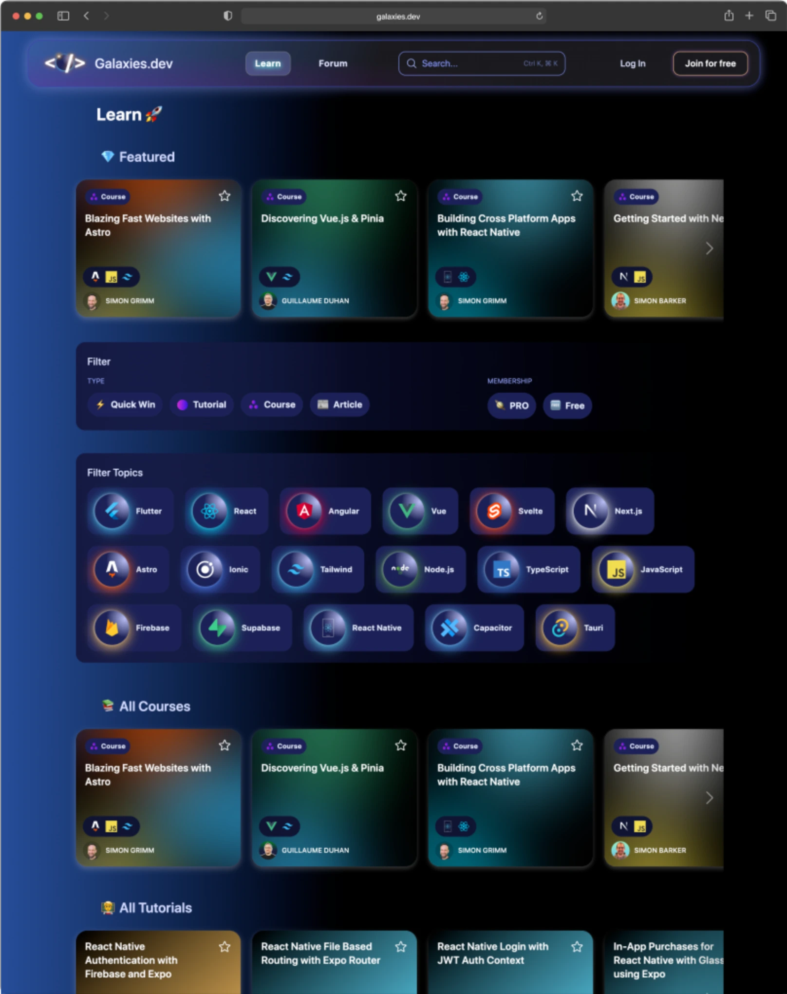
Netflix-style discovery
We designed the course and tutorial page in a Netflix-style layout to enhance easy discovery and grouping. This intuitive interface allows users to browse courses just like they would find shows on Netflix, making it easy to find content like "Fun Weekend Projects" or "Advanced JavaScript Techniques."
This user experience is effective for learning web dev as it simplifies navigation and reduces cognitive load. Grouping courses by themes helps users quickly identify relevant content, creating a more engaging and efficient learning experience.
Filtering
We implemented a tech icon filter to streamline the exploration of different libraries. This intuitive filtering system uses recognizable icons to represent various tech stacks, allowing users to quickly find and navigate to the resources they need.
Feature
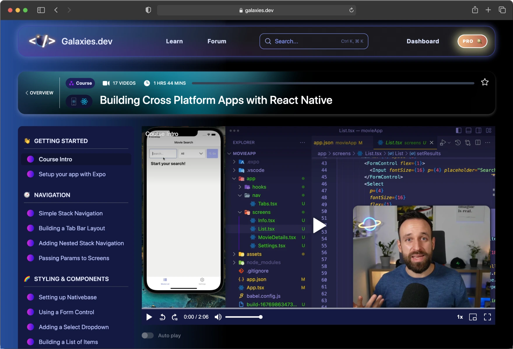
Course page
Player with keyboard controls & theater view
Feature
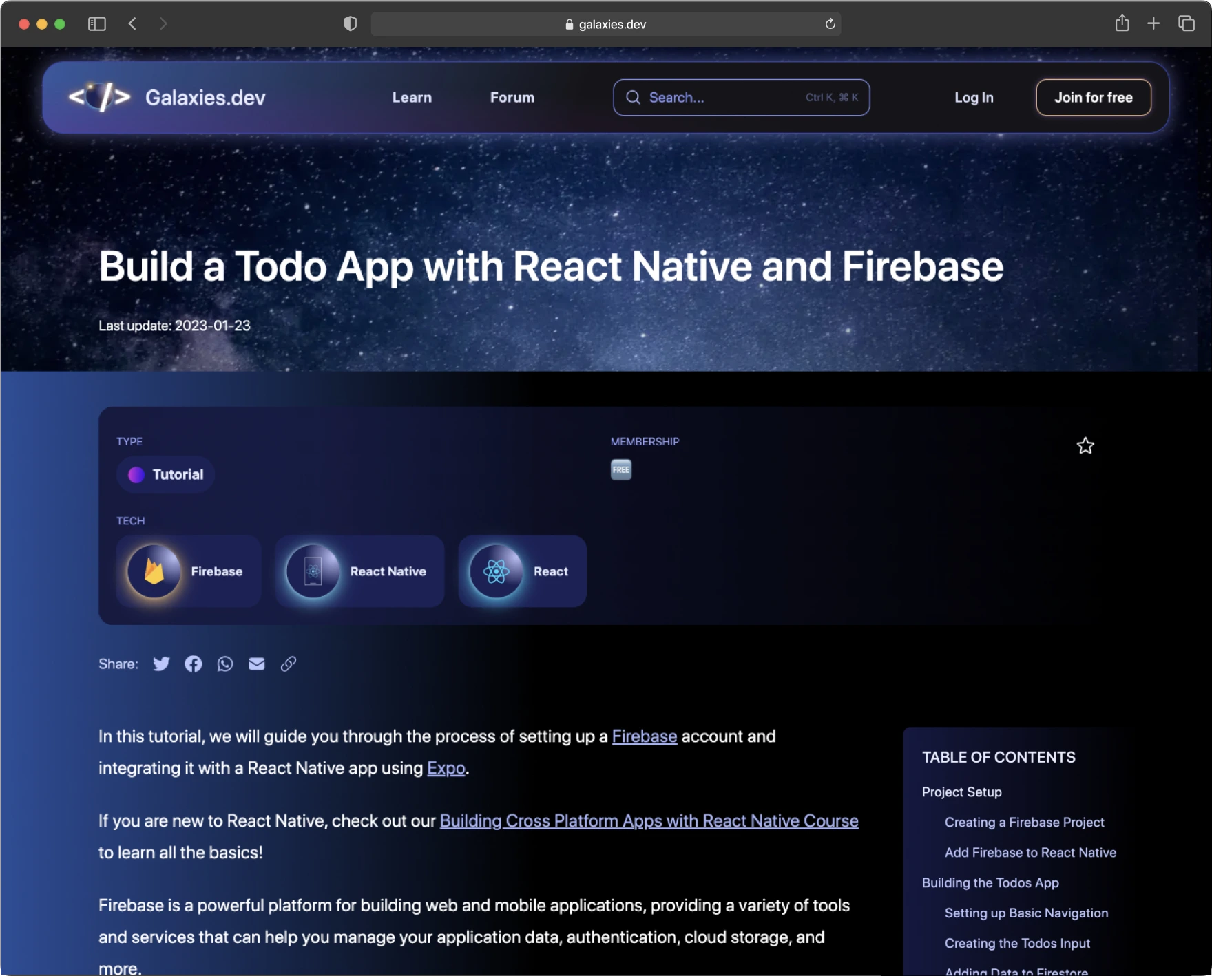
Tutorials
Table of Contents that tracks with content
Adaptation
Adaptation
Inital outcomes & challenges
-
Upon the initial release, our site received a moderate number of signups compared with existing user numbers.
-
Despite good signup numbers, we observed a low conversion rate to Pro subscriptions.
-
What can we do to improve Pro conversions? This is our most important challenge.
Adaptation
Discovering a pattern
As we dug deeper, we noticed many new signups accessed React Native courses. We reached out, and their feedback was clear: they struggled to find high-quality React Native content.
Adaptation
What we learned
Through talking with new users, several things became clear after the release and testing our pivot.
-
Simon being an expert in Ionic meant that most people interested in his content were focused on app dev over general JavaScript dev.
-
Users were interested in new frameworks and free content but only paid for content that helped with their current job or specific role, to skill up in one area and will pay for it.
-
React Native was very popular & had much more interest than Ionic, but there was no educators specifically focusing on it, so there was a gap in the market.
Adaptation
Refocusing the service
Based on the results of initial release, the uptick from React Native devs and their feedback, we decide to reinvent the service as a React Native-focused one.

Adaptation
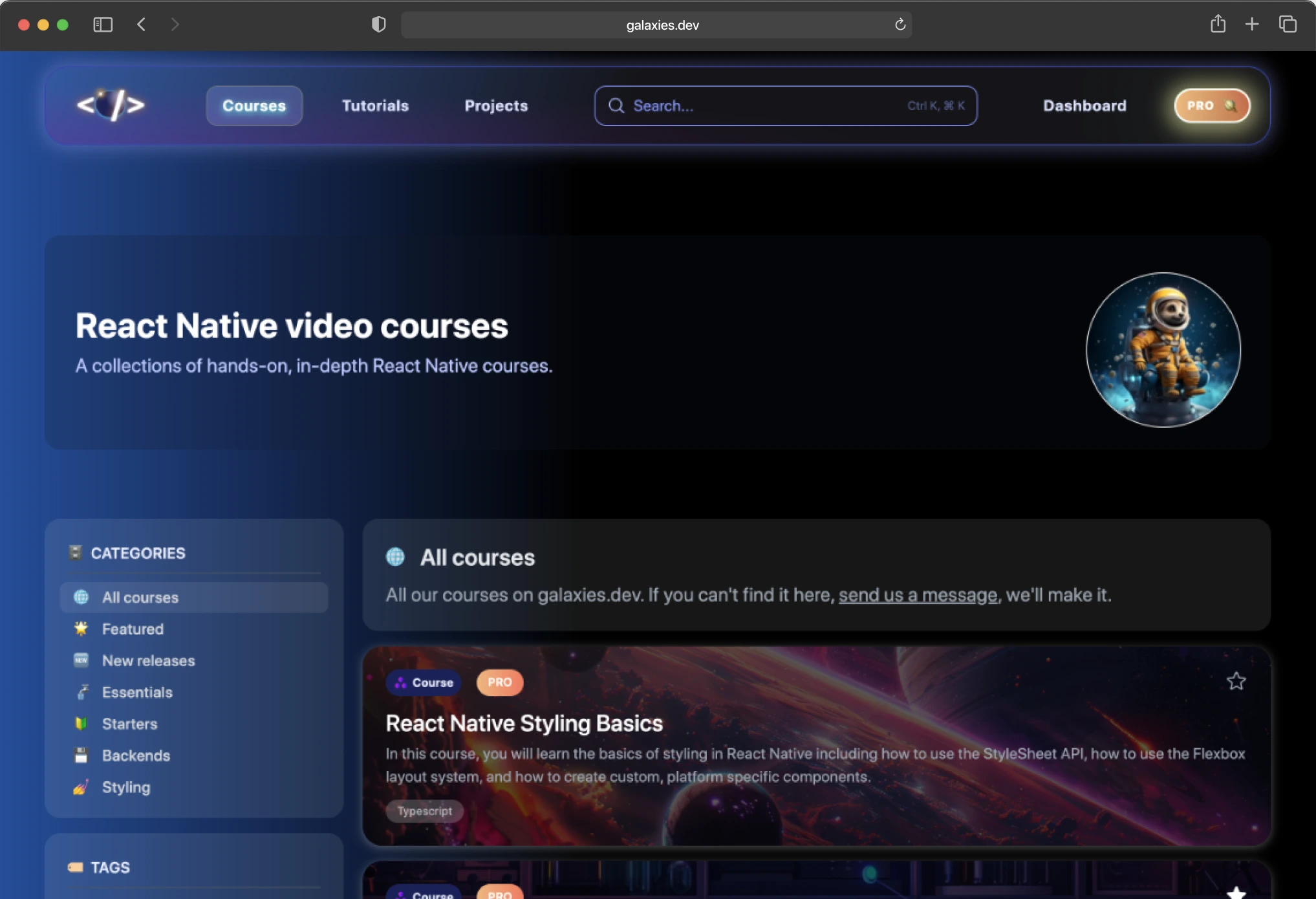
Reworking navigation
User feedback revealed that these users frequently sought specific content. Therefore, we redesigned the course page to enable quicker filtering by technology and topic. This approach replaces the previous casual, Netflix-style browsing with a more focused, one-directional filtering system.
Outcomes
Outcomes
Outcomes after adaptation
-
When compared with Simon's Ionic-focused sister service, galaxies.dev grew at a 10x rate after the React Native pivot.
-
After six months, the service had grown to the equivalent size as the sister service, which had taken more than six years.
-
Even after the initial growth of the service after pivot, galaxies.dev continues to have impressive growth, currently at 1,000 users per month.
Reflection
Kind words from the client

It's rare to encounter a talent who not only excels in aesthetics but also possesses the technical prowess of a seasoned coder. Brett that rare gem. Collaborating with Brett on my project was a masterclass in creativity, and practical execution.
His ability to understand, interpret, and then transform my nebulous ideas into a cohesive and striking brand identity was remarkable. His approach was not just about design; it was about creating a narrative that resonated with my brand's core values and vision.
Beyond the work we did together, Brett has become a trusted friend and advisor. His ongoing input and ideas continue to add value to my brand, long after the project's completion. His passion for design and innovation is contagious, and our brainstorming sessions are something I look forward to greatly.
In Brett, you don't just find a designer; you find a visionary partner who will journey with you in turning your vision into a tangible, beautiful reality. I can't recommend him highly enough.
Reflection
My thoughts
A few of my thoughts after finishing this project.
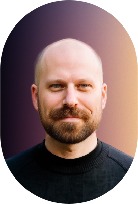
When working on Galaxies.dev, I had never worked with a client & team where we were so in tune with each other—it was almost like we could read each other's minds. The way we collaborated grew so naturally, out of excitement and curiosity, just watching it unfold before our eyes almost effortlessly. I am so proud of what we created together, and I am truly grateful for the experience.
I am excited for Simon & Galaxies because I can see the potential in the brand and the concept, and I believe he is perfectly positioned to keep expanding his user base, provide an increasingly better learning experience for his customers, and develop the service into something well beyond the one-man origins, as was his goal when we started the project.
In the work that we do, we don't ever get to feel like we made something perfect, but in this case I think we got pretty close, flaws and all.