FindFlow & services
An AI service by Recursive, helping companies provide employees with quick answers to internal questions, and related services.
Contribution
- Branding
- Visual identity
- Product design
Client
- Recursive
Dates
- 4/2023 - 4/2024
Context
Background
Recursive is an innovative Japanese company focused on creating a fairer, more sustainable society by leveraging AI to help companies find fundamental solutions to social issues.
Challenge
Recursive envisioned a product called FindFlow, enabling employees to use AI to find answers to internal operational questions, reducing resource usage by minimizing repetitive communication.
Role
My role was to help Recursive develop a unified visual language for their brand and service, aimed at enabling their developers to create consistent, iterative prototypes that would form the service's foundation.
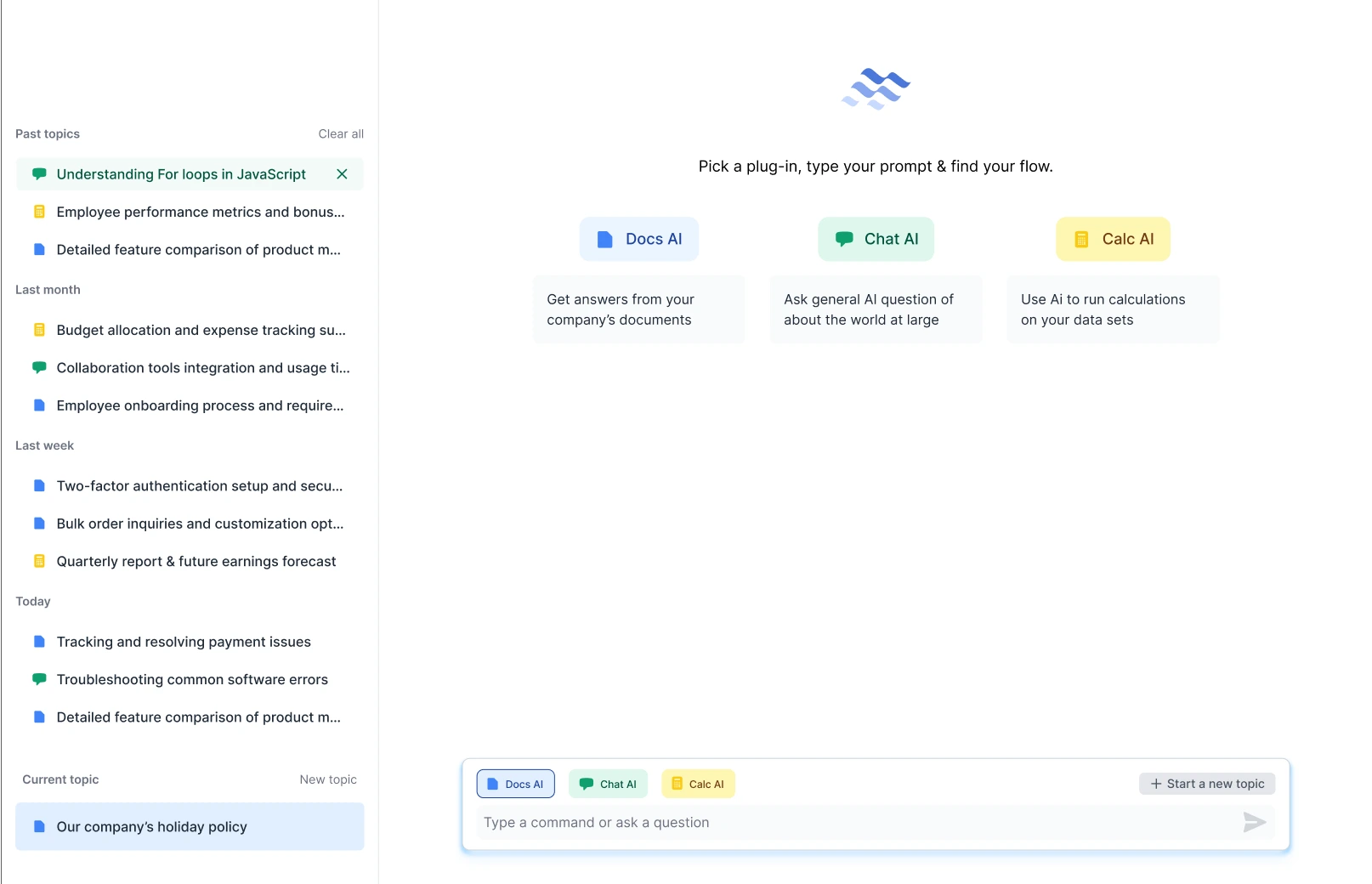
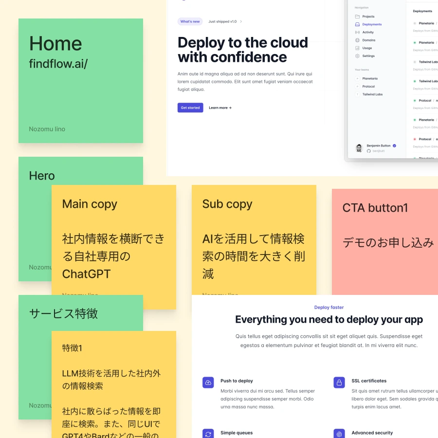
Business goals
Create a brand to define FindFlow & MVP version of the product.

-
The brand should be in line with the overall Recursive brand, as well as appeal to Japanese corporations, which have specific aesthetic considerations to be aware of.
-
To enable the developers to work efficiently, we created a visual language based on the brand to give clarity to the development & marketing teams.
-
Create a new flexible brand identity that allows for the new frameworks & libraries as well as new expert instructors to enhancing the platform's appeal.
Highlights


Highlight
The winner
The finished, collaboratively designed logo and logotype evoke a simple flow that echos the name of the service, and the logo type borrows its DNA from its parent, Recursive.
Highlight
A unified suite of AI services
As new services joined the suite, we developed a cohesive family of brands that aligned with FindFlow.
We also adapted Borealis, an existing service, to match the suite's tone.
Process
Further evolving the style
After getting a base style, we tried subtle variations on it to find the right tone we wanted for the app.
Highlight
How we used collaborative processes
We used a collaborative approach to design, asking for early stage, broad input and feedback from stakeholders, and making decisions through workshops and async collaborations.
Learn More About This Project
There's much more to this project, including the steps we took and the key decisions made along the way. If you'd like to see the full picture and explore the details, feel free to continue on below.
Process

Process
How we approached the work
-
We wanted to make sure that the team had proper input so the brand we create would reflect their knowledge of the product and their customers, so that they feel confident in the design.
-
Through a collaborative approach & techniques that rely on stakeholder input to iterate, we developed a vision that aligns with all requirements and has the full support of the entire team.


Process
Techniques we used
A structured approach to design, focusing on iterative development and user-centered practices.
-
To capture the stakeholders' vision, we ask them to gather inspiration from logos and websites that reflect the desired design aesthetic.
-
To quickly iterate on the website's flow, we use sticky notes to map the structure and collage elements from other sites to convey ideas.
-
Through Design Thinking-based workshops, we gather input, receive feedback, vote, and iterate to refine and narrow down ideas & designs.
Process
Figuring out the branding
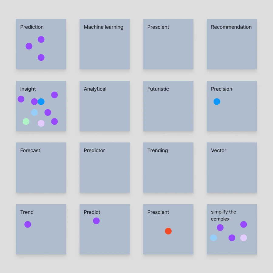
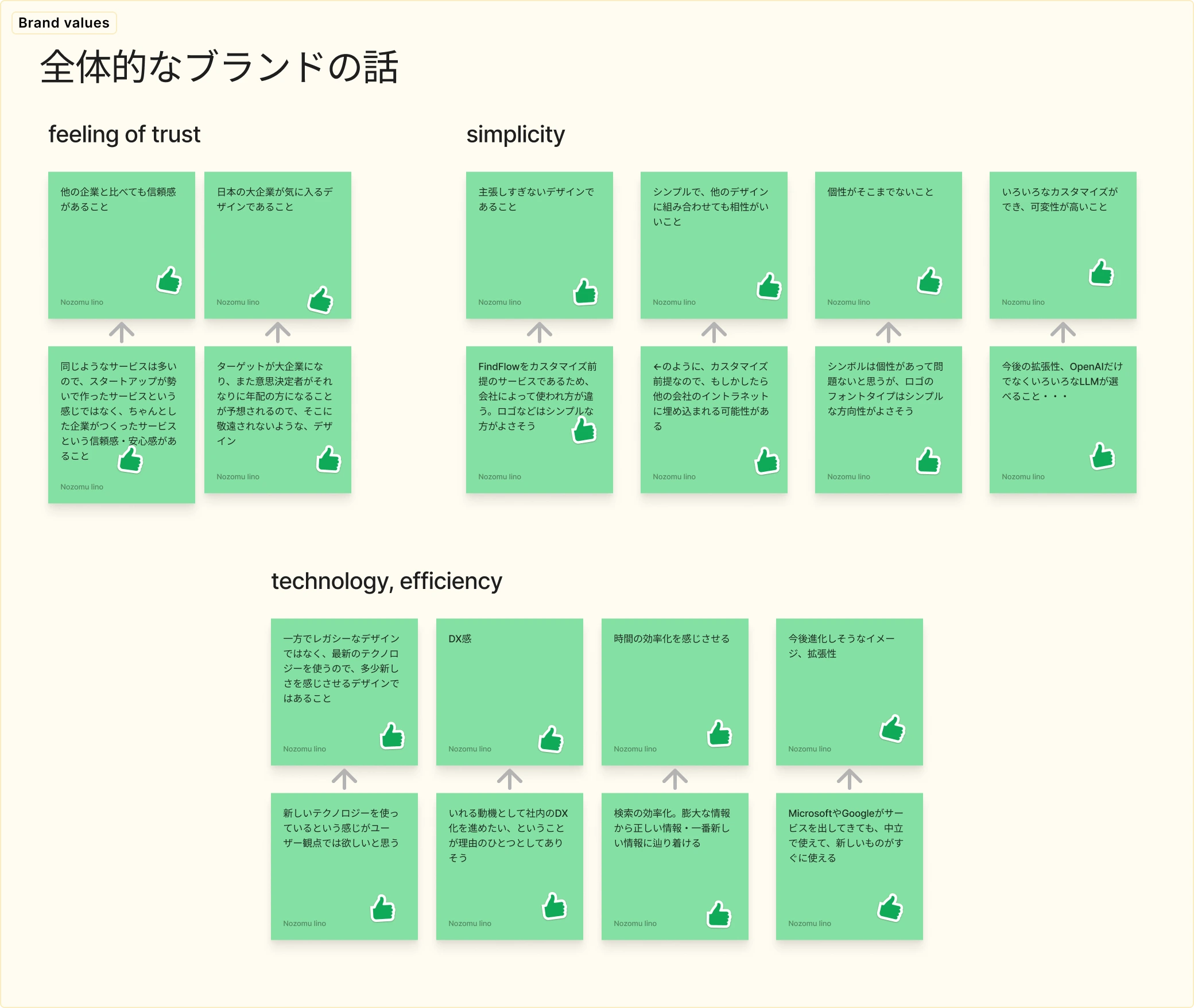
We explored brand values & identity, as well as as color palettes & logo styles through a series of exercises.
We identified the values the brand should convey and sorted them into “feelings of trust”, “simplicity” and “technology/efficiency”.
Process
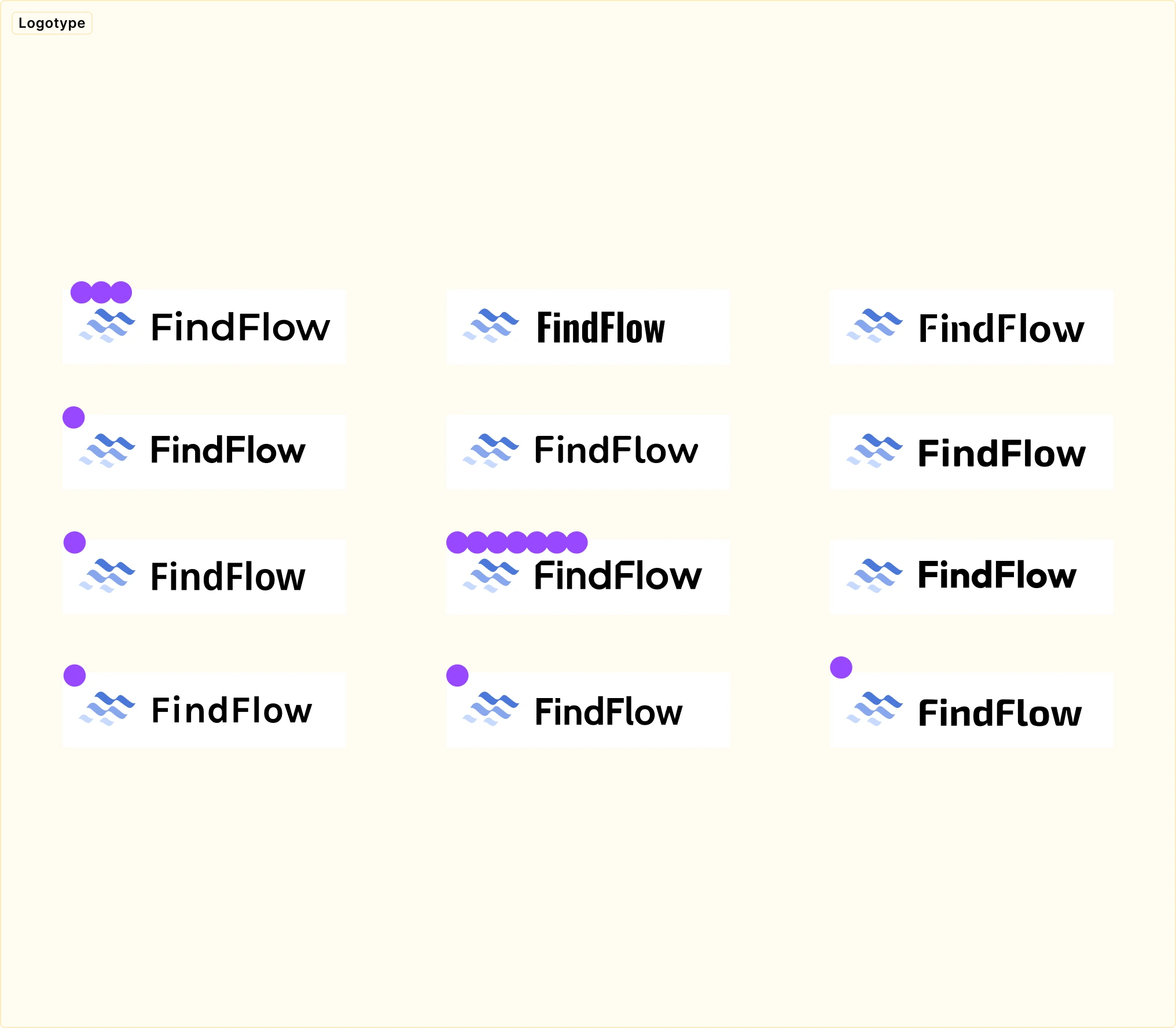
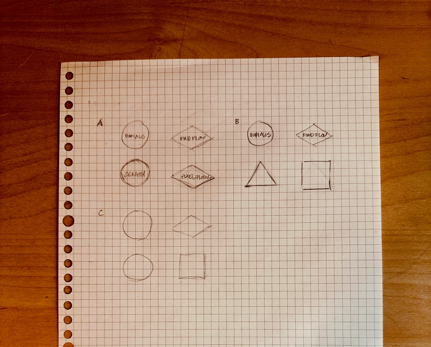
Narrowing down the logo
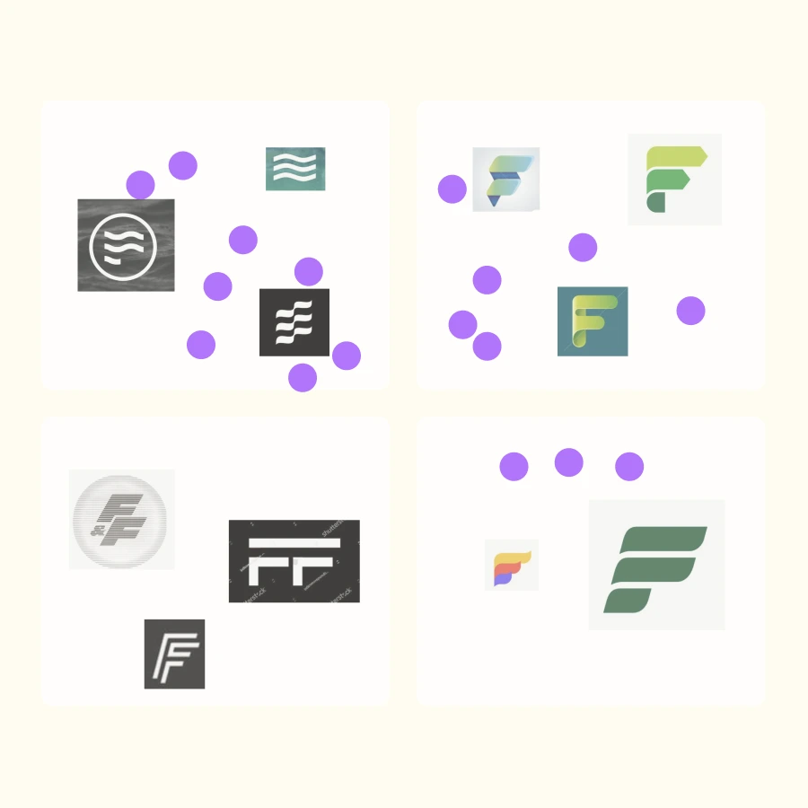
We used found images to gauge the type of logo that the stakeholders envision.
From prior conversations, it was clear that the logo should have an element of “flow” and maybe an “F”. The stakeholders preferred the more abstract, simplistic styles.
We experimented with several different fonts for the logotype, but the font used by the parent brand was clearly preferred. I implemented a sliced off top left of the letter “F” to echo the Recursive logotype.
Process
Evolving the concept
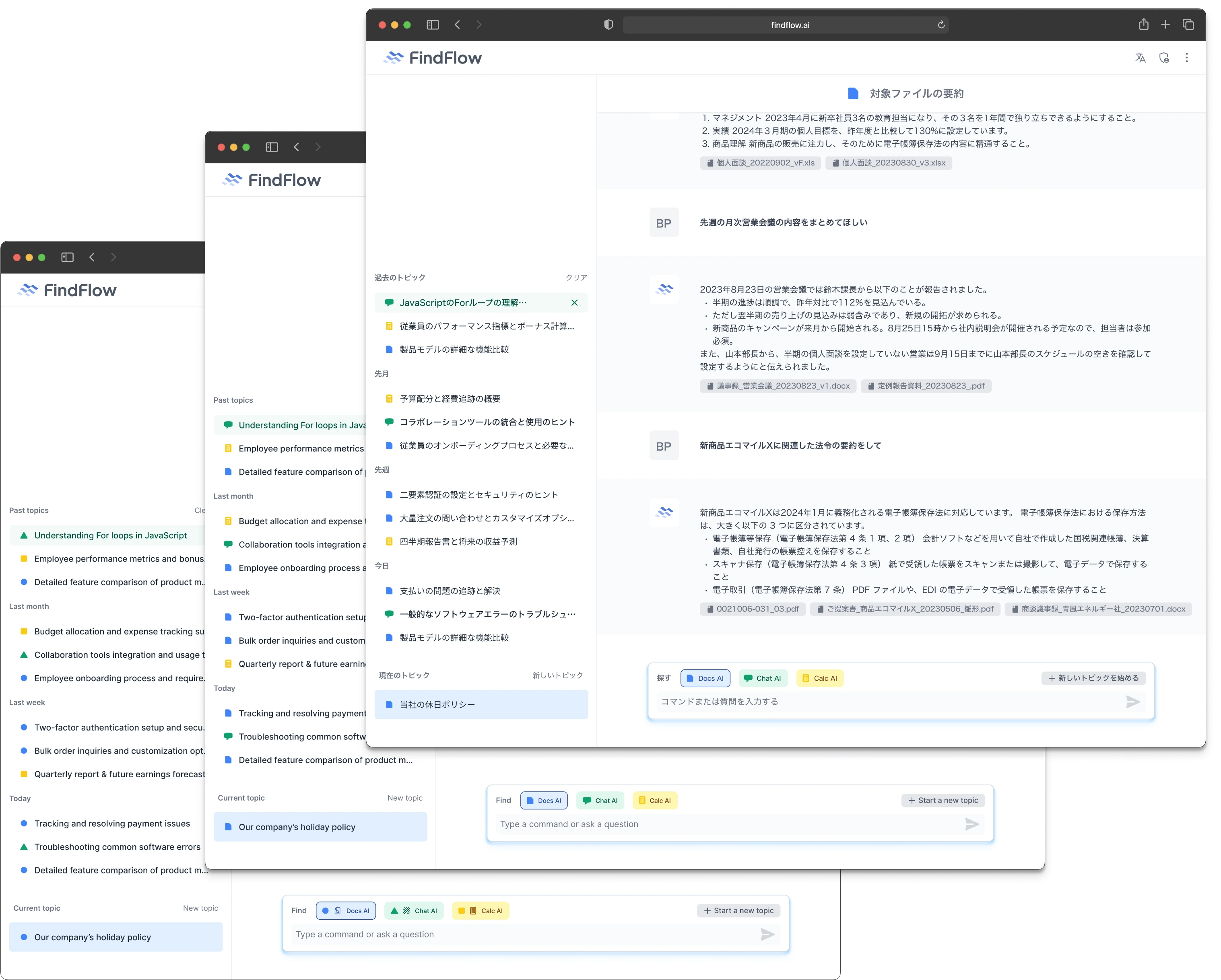
We took went through several iterations of the designs, quickly creating multiple UI options and then narrowing down.
We expanded the types of AI that can be used as optional modes.
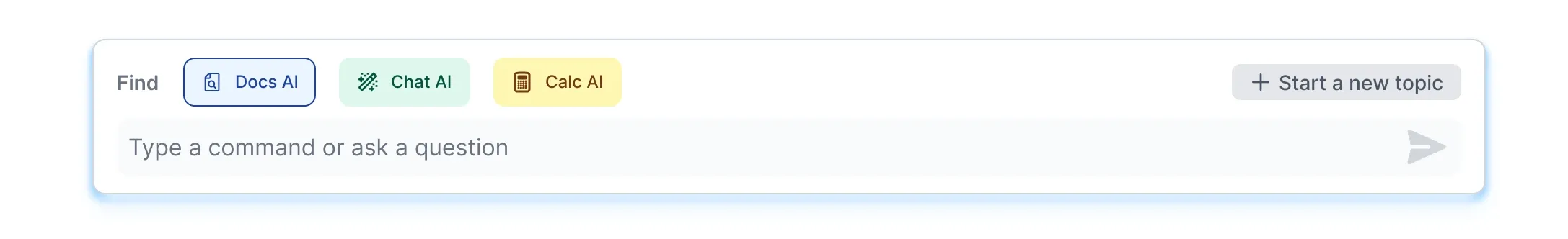
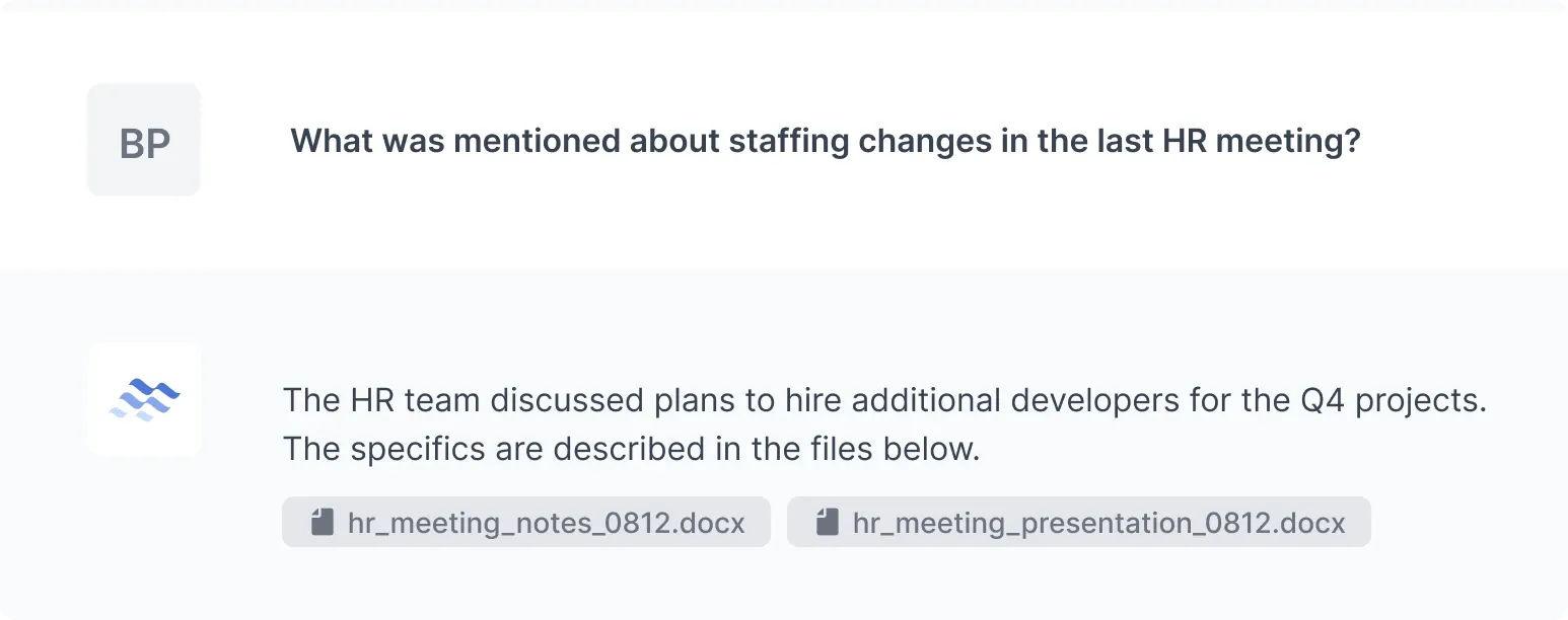
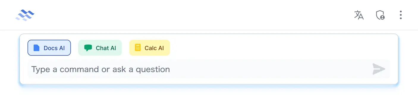
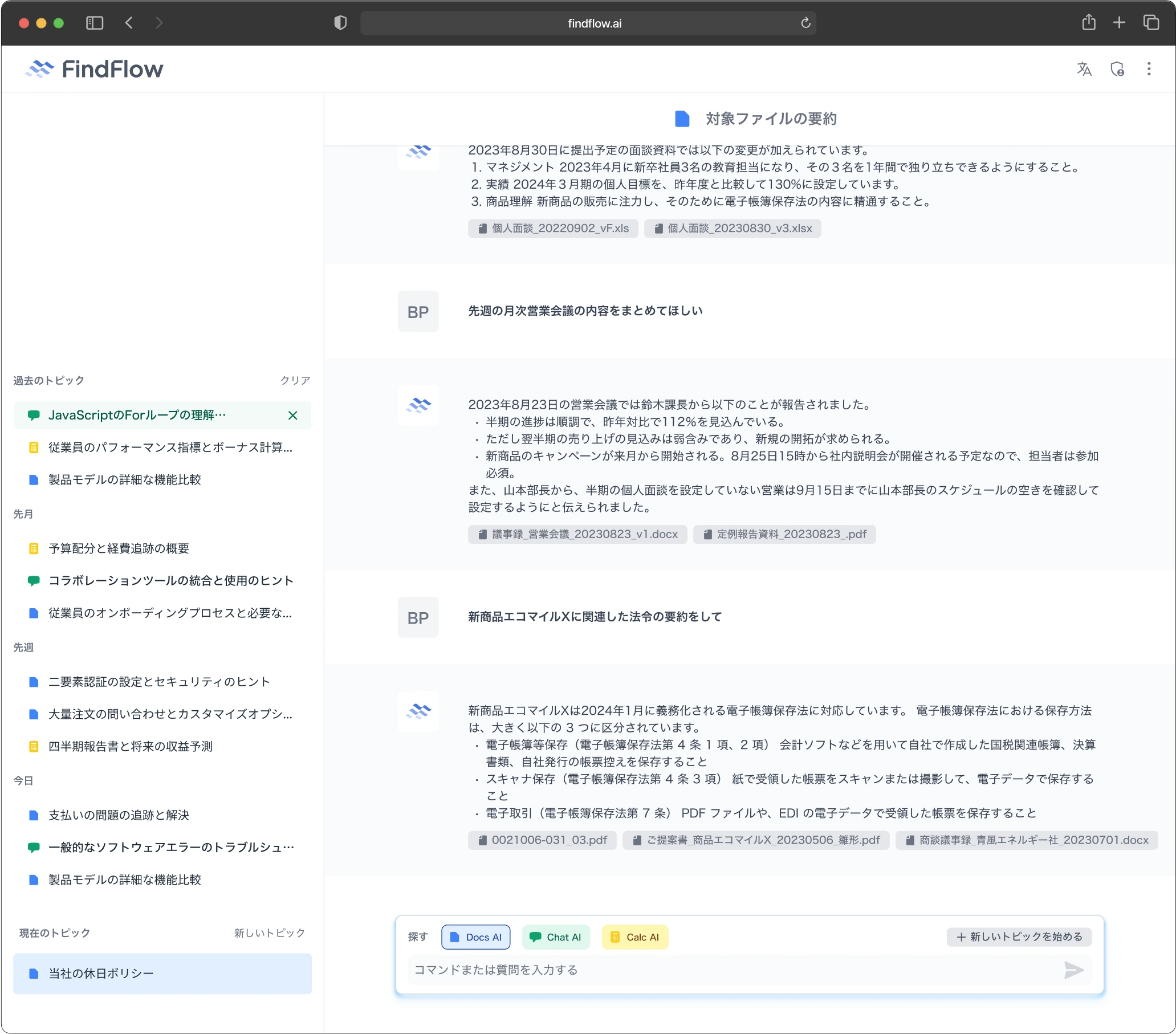
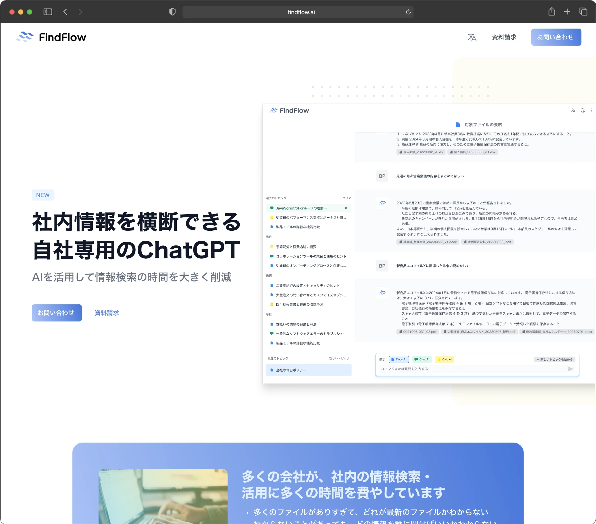
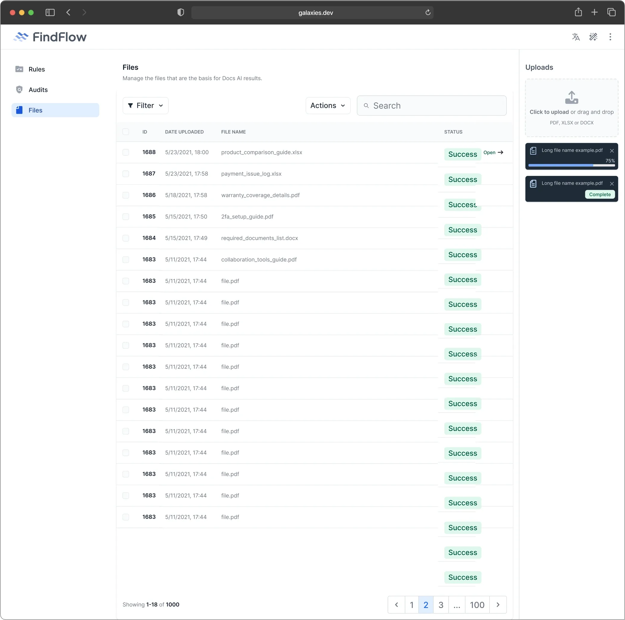
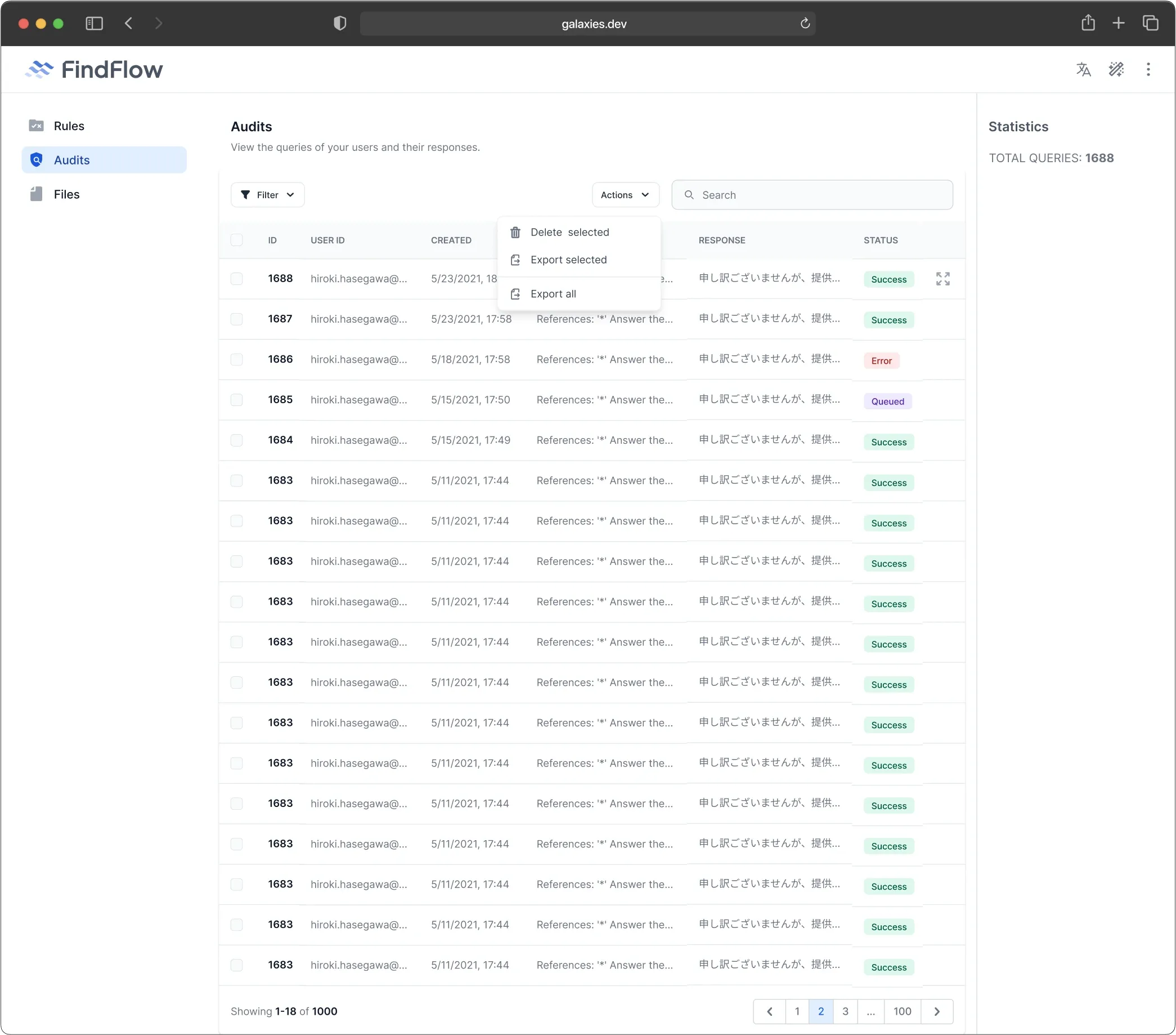
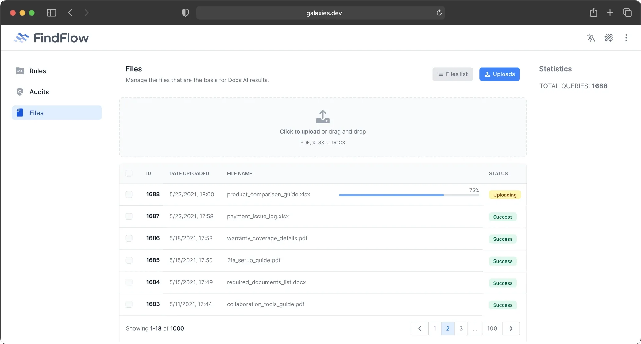
Chat style & file references
We added file reference links, to show where information was taken from, and to provide easy access for users.
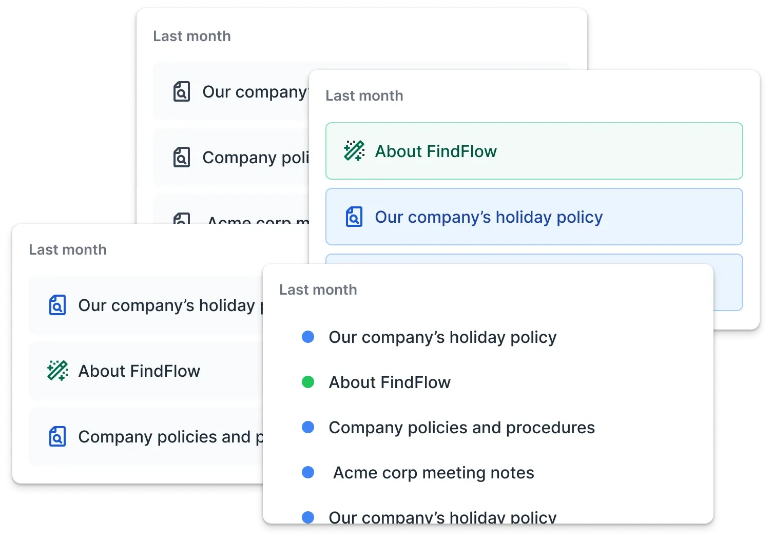
We tested several topic styles looking for the right fit visually and informationally.
Process
Further evolving the style
After getting a base style, we tried subtle variations on it to find the right tone we wanted for the app.
We tried several version of ways to identify the AI modes in the application.
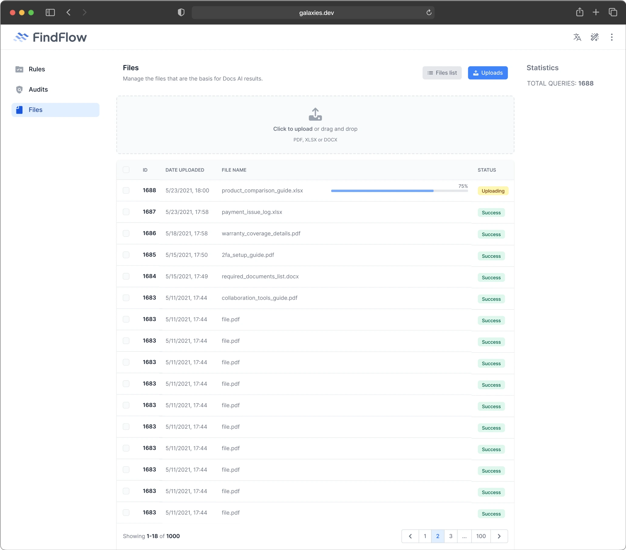
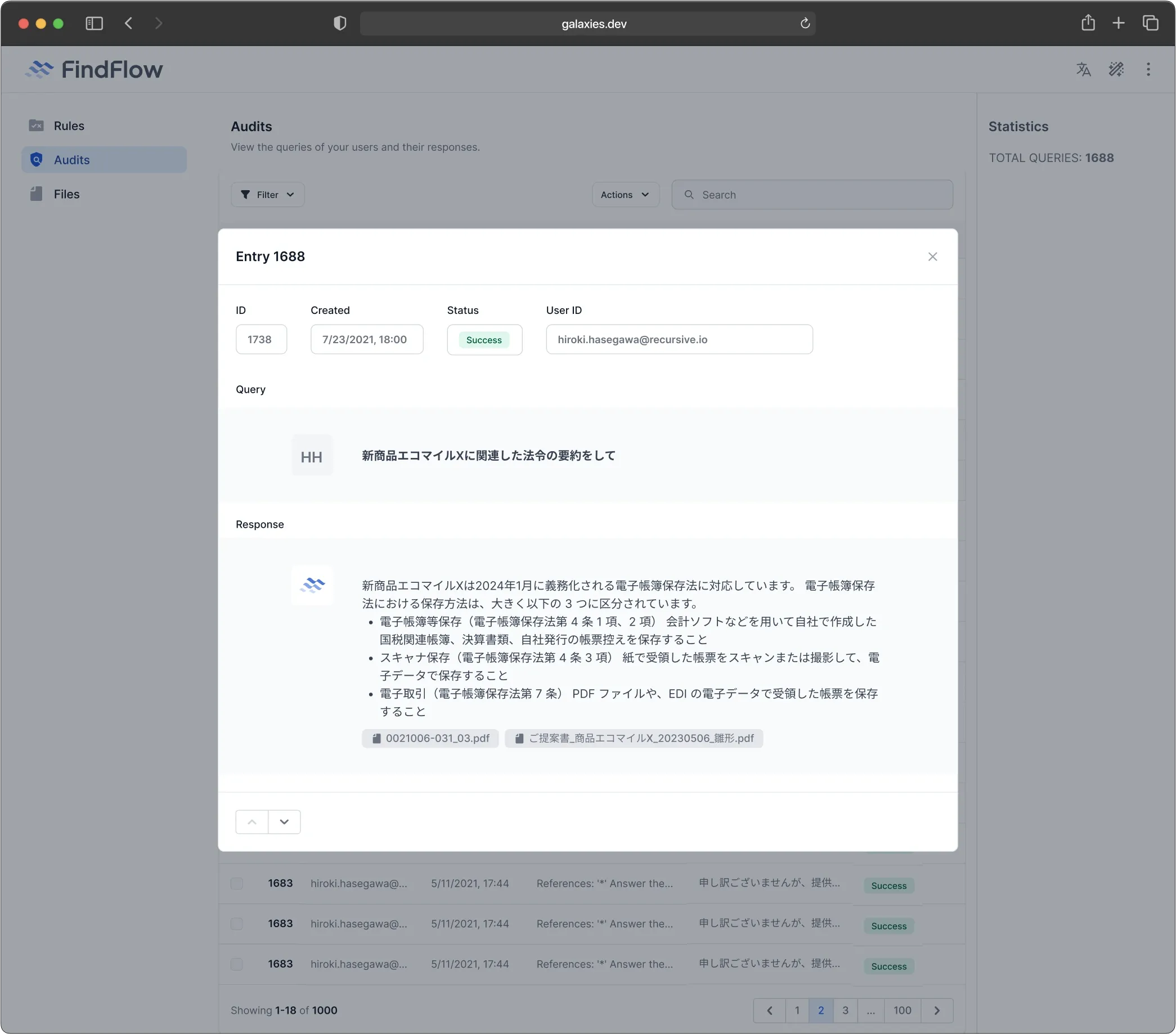
Dashboards
We added dashboard screens for the management aspects.
Extension

Extension
Creating a unified suite of applications
After creating FindFlow, Recursive wanted to create two additional brands for two services they had in production, as well as harmonize those three services with an already existing service called Borealis.
Extension
Initial consideration
During discussions with the stakeholders, we identified a few guiding desires for the brands.
- Low-res
- Symmetry with FindFlow
- 8-bit art inspired
- Strong colors
- Purple/vivid pink vibes
- Borealis logo as a base
-
Palette/gradient that evokes the sun
(as opposed to Borealis's cold colors) - Like SpaceX or NASA logo
- Implying directionality, trajectory
- Solid foundation pointing up
Alignment
We need to make a decision about how the four brands will be aligned. Will they stand alone as brands or be part of one suite?
Due to similarities between FindFlow & ImageAI, as well as between Borealis & VectorAI, we decided that they would be two sister brands, part of the greater whole.
Extension
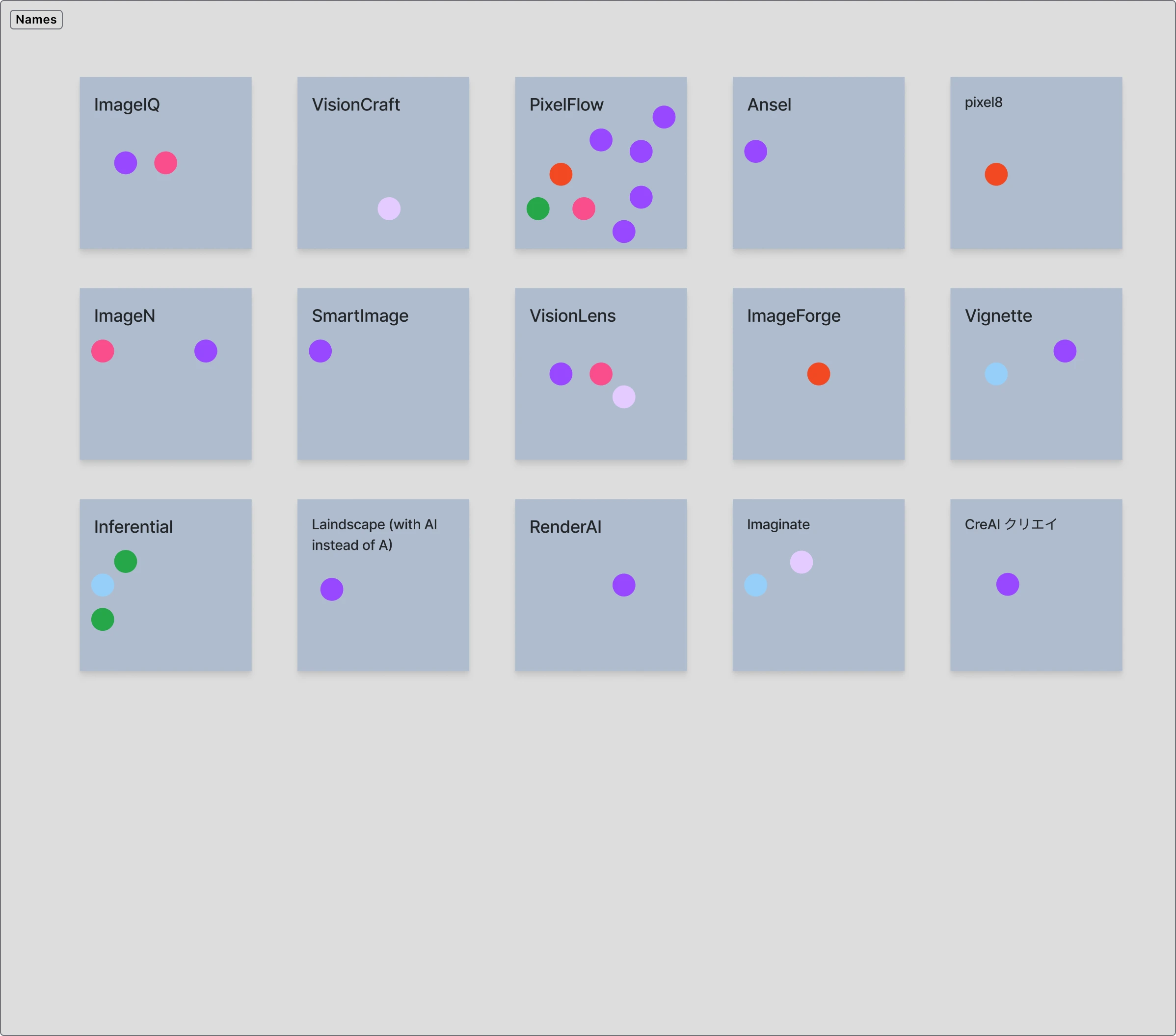
Finding the themes & names
We had the stakeholders add words & phrases that best describe the service and its value, and used those to create possible names, and narrow them down, with PixelFlow being the clear winner.
With FindFlow, we did most of the workshops live, but for these services we did them async to allow for a greater number of stakeholders.
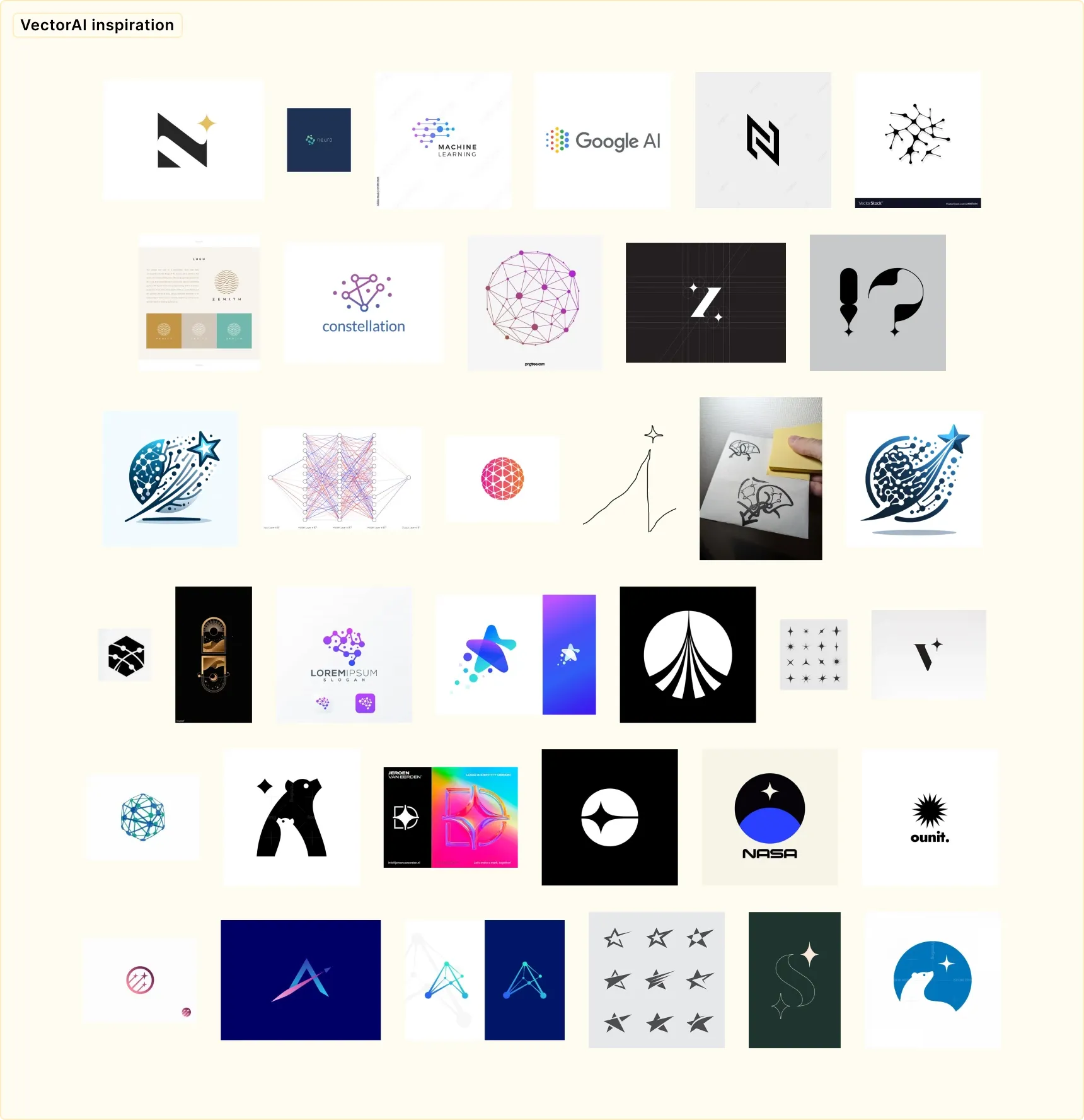
Gathering & imagining
As a stating point, I drew up some ideas based on the defined parameters & our generated ideas.
The images are a mix of found items, sketches, and AI —all put together by the team to get their ideas out of their heads and into the world. It’s our way of sharing and shaping the vision together.
Voting on the options
After narrowing down, we voted on the options once more.
An issue
One aspect of the VectorAI logo that the stakeholders preferred was combination of vectors & constellations, but after voting on the options, we became concerned with readability at small sizes.
A reworking
We reworked & simplified the VectorAI logo to address readability issues at small sizes, and came up with more elegant solutions.
Where we landed
After picking the final choices for the two new logos, we gave the logotypes the same treatment.
Then we modified Borealis to match the tone of the other three new services.
Some paths not taken
Here are a few ideas we had but didn’t use.
Reflection

Reflection
Thoughts from the team
Some feedback I received from the Recursive team.
- Co-founder & CEO
- Recursive
Brett has been a thoughtful partner to take us on a journey that started as a visual design exercise but turned into a branding project for all of our four technological platforms.
His approach ensured that the whole team was heard and diverse view points were taken into account, resulting in a consistent brand identity for all our technologies.

Reflection
My thoughts
A few of my thoughts after finishing this project.
Working with the team at Recursive has been a great experience for me. The leadership at Recursive wanted to get input from everyone to create a shared vision, so that they could develop products with buy-in and excitement from the entire group. This openness to collaboration gave me the permission to guide the process and act as a conduit for the group to realize its shared vision. The whole process felt positive and fluid; rarely have I worked with a group so effective at achieving such goals so effortlessly.
I can see this is the attitude and approach they bring to their work in using AI to improve sustainability for customers. Through working with them, they have opened my eyes to the potential of their work. I believe the brands and UI base we created will act as a catalyst for them. I can see that this is only the beginning, and I am excited to see where it goes.
