Open-source branding
Like this logo for Ionic Svelte. Need a logo? Reach out.

A curated selection of impactful projects and designs I have worked on.
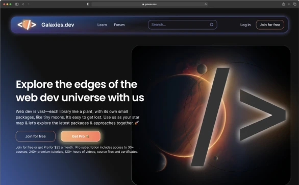
A web dev learning platform.

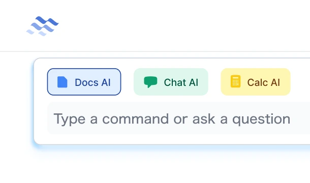
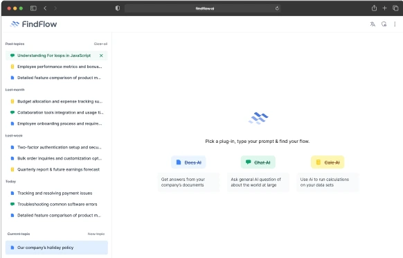
An AI service by Recursive for quick internal answers, and related services.


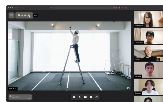
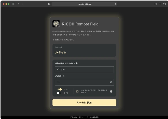
Live 360° 4K video chatting for the Theta & Oculus.
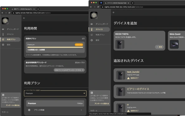
A unified design system for an suite of apps.
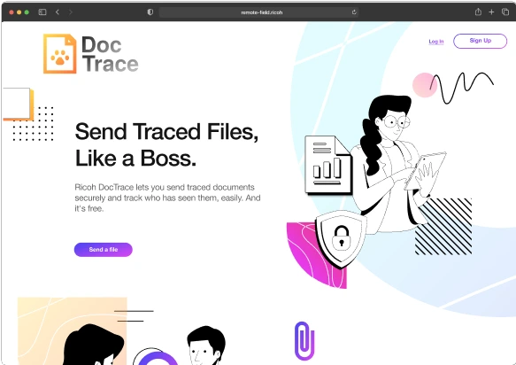
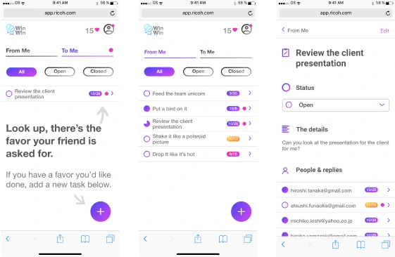
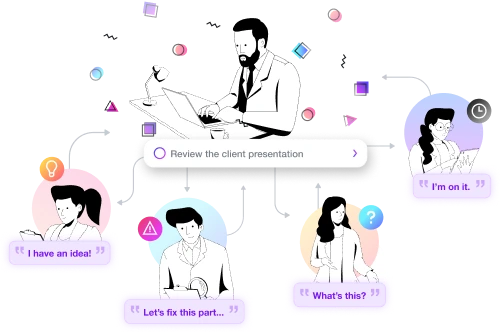
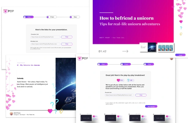
I'm not your typical designer or dev—love of design & craft led me to dive deep into Japanese aesthetics and crafts, and to have lived half of my life in Japan, mostly in Kyoto ⛩️.
I'm obsessed with crafting elegant, user-centric websites and applications. I live for design systems, web components & the future of the open web. UX research, collaboration, and design-thinking workshops allow me to merge team insights with user needs, driving the design and development process forward. ❤️
These are some of the activities, talks & community-related things that I am proud of.
I do talks & workshops, like this one at Creative Tokyo on Design & product management
Created a design-dev learning program at Ricoh
Like this logo for Ionic Svelte. Need a logo? Reach out.
Casual workday meet-ups for remote/freelance tech workers, mainly in Tokyo, at the moment. Join us.
I'm a core member of the React Material Web Components team, and I contribute to various projects.
Just send me a message
I really appreciate you taking the time to check out my site. 🙇♂️
I'd love to know how you found me & make a connection. 🤝
If you wouldn't mind letting me know, please reach out and say "hi". 😃
Cheers,